Crafting a Twitter like sticky sidebar
Have tinkered with JavaScript majorly | I like to solve problems on Stack Overflow, write blog articles, create a side project or do something creative.
Introduction
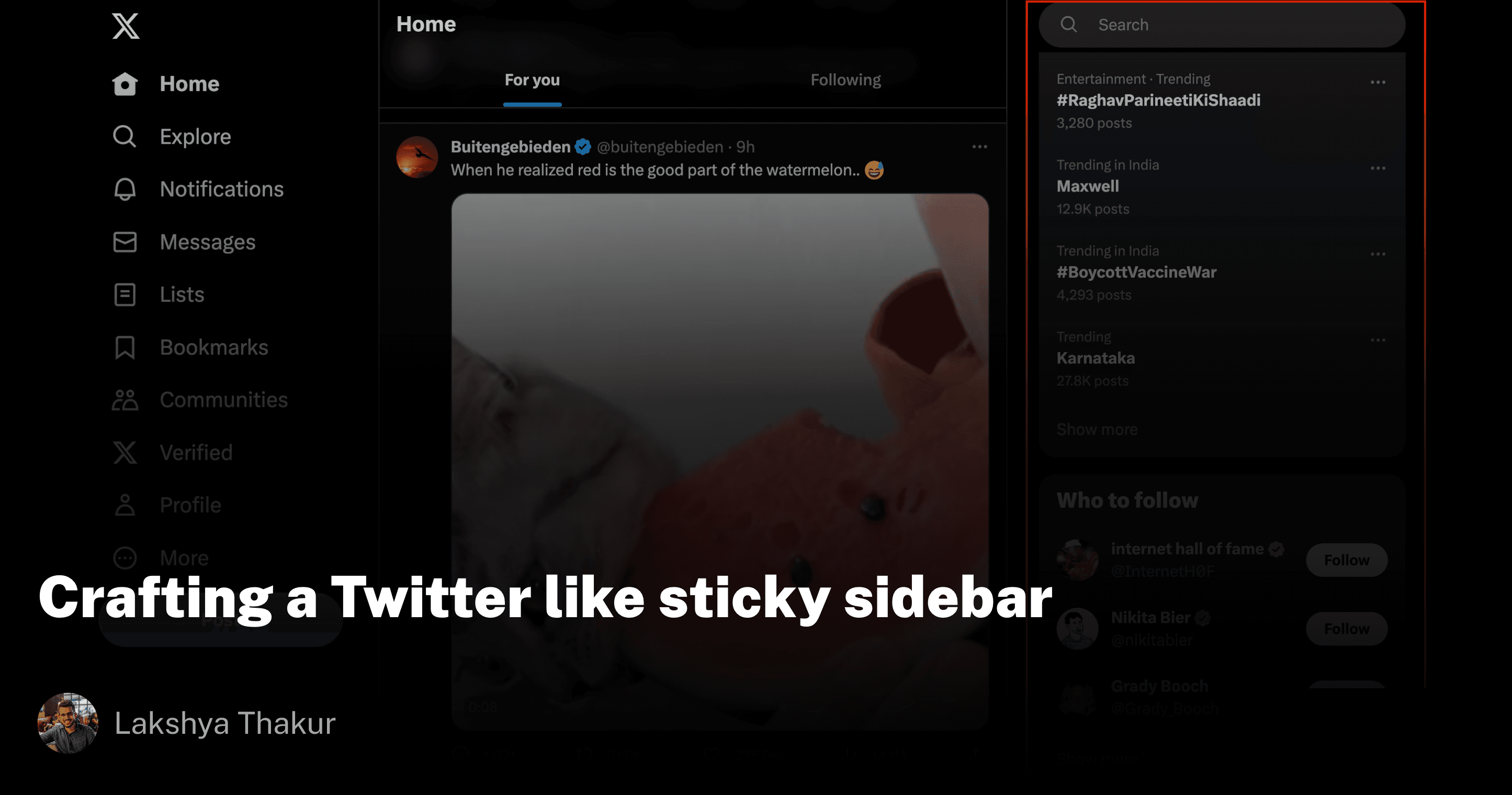
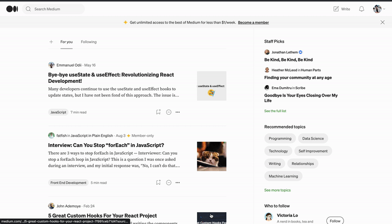
You're scrolling through Twitter (I still like calling it that) or Medium and you get a nice view of the sidebar as it snaps to the bottom or top of the page if you try to scroll beyond its boundaries.
We will re-create the same experience through a react implementation.
But before that, let's observe how the properties of these sidebar elements mutate as you scroll the viewport in existing implementations.
Observations
Twitter - On Twitter, as you scroll from top to bottom of the screen and the bottom of the sidebar comes into view, the sidebar's
positionbecomesstickywith a mutatedtopvalue. There is also amargin-topon the sidebar element. Now if you scroll from bottom to top the sidebar remainsstickybut now with a mutatedbottomvalue. Again, themargin-topvalue changes in this case.Medium - On Medium, as you scroll from top to bottom of the screen and the bottom of the sidebar comes into view, the sidebar's
positionbecomesstickywith a mutatedtopvalue. Now if you scroll from bottom to top, the sidebar'spositionisrelativealong with a mutatedtopvalue.
I found that Medium was able to get the bottom stickiness working without explicitly setting a bottom value and no margin-top manipulations (Although margin-top does exist on the element, removing it didn't do anything). So only two properties, namely top and the position needed to be mutated if we went with this implementation.
Considerations
With that in mind, I first thought of an Intersection Observer implementation where I will use two pseudo divs wrapping the actual content and observing their intersection with the viewport to make certain decisions on how to mutate the sidebar properties.
Here is how the HTML structure for this implementation looked like:-
<div> - Sidebar element
    <div/>  - Top pseudo div
        {children} - sidebar content
    <div/> Bottom pseudo div
</div>
While making this work, I realized that it might be hard to not use stuff like getBoundingClientRect or offsetHeight properties to compute certain cases which Intersection Observer (IO) might not account for. I thought to avoid those for performance reasons as reading them may result in reflows whereas reading values inIO doesn't cause that.
So I shifted to pure DOM calculations from the IO approach to keep it standardized. It might not be the most ideal approach but works well.
Here is how the HTML structure for this implementation looked like:-
<div> - Sidebar element
  {children}
</div>
Again, the calculations need to happen inside a scroll listener because the logic depends on whether you're scrolling up or scrolling down.
Implementation
The full-fledged implementation is available below but I will be sharing and explaining those bits which cover the conditions that govern when the sidebar is sticky and when it's not.
Let's observe some set of important conditions(inside a scroll handler) that give the sidebar that sticky behaviour
if (isScrollingUp) {
  if (isTopEndBetweenViewport) {
    setPosition('sticky');
    setTop(topPositionAtWhichElementBecomesStickyFromTop);
  } else if (isBottomEndBetweenViewport) {
    setPosition('relative');
    setTop(topDistanceOfElementRelativeToPageTop - offset);
  }
} else if (isScrollingDown) {
  if (isTopEndBetweenViewport) {
    setPosition('relative');
    setTop(topDistanceOfElementRelativeToPageTop - offset);
  } else if (isBottomEndBetweenViewport) {
    setPosition('sticky');
    setTop(topDistanceAtWhichElementBecomesStickyFromBottom);
  }
}
Explanation:-
When a user is scrolling up:-
If the top of the sidebar is visible, then we set it's
positionassticky. We also set it'stopvalue to what we want it should start sticking from.If the bottom of the sidebar is visible, then we set it's
positiontorelative. We also set it'stopvalue to what we know the element itself has offset by from the top of the page. So suppose you're at1234pxfrom the top of the page thentopwill become1234px.
When a user is scrolling down:-
If the top of the sidebar is visible, then we set it's
positionasrelative. We also set it'stopvalue to what we know the element itself has offset from the top of the page. So suppose you're at436pxfrom the top of the page thentopwill become436px.If the bottom of the sidebar is visible, then we set it's
positiontosticky. We also set it'stopvalue to what we want it should start sticking from the bottom. This will be mostly a negative value.
Now let's see more conditions within the scroll handler that do not depend on the scrolling direction but instead are required to exit early even before reaching the direction-based logic we discussed above:-
if (isTopEndBelowViewport || isBottomEndAboveViewport) {
  setPosition('relative');
  setTop(scrollYOffset);
  prevScrollTop = scrollYOffset;
  return;
}
if (areBothTopAndBottomEndsOnOppositeEndsOfViewport) {
  setPosition('relative');
  setTop(topDistanceOfElementRelativeToPageTop - offset);
  prevScrollTop = scrollYOffset;
  return;
}

if (areBothTopAndBottomEndsBetweenViewport) {
  setPosition('sticky');
  setTop(topPositionAtWhichElementBecomesStickyFromTop);
  prevScrollTop = scrollYOffset;
  return;
}
Explanation:-
If the top end of the sidebar is below the viewport or the bottom end of the sidebar is above the viewport, we will set it's
positiontorelativeand itstoptoscrollYOffset(alias forwindow.scrollY). But when can we run into such a situation? It's possible while navigating between pages that the sidebar unmounts and mounts or some race conditions caused it to not be at its correct position. More of an extra check that can help mitigate those.If the top end of the sidebar is above the viewport and the bottom end of the sidebar is below the viewport, we set its
topvalue to what we know the element itself has offset by from the top of the page.If the top end of the sidebar and bottom end of the sidebar are both visible in the viewport, we set its
positionassticky. We also set it'stopvalue to what we want it should start sticking from. If the sidebar is too long, this becomes more apparent in the zoomed-out view.
Let's explore the variables used in the above code snippets:-
topPositionAtWhichElementBecomesStickyFromTop- This is user-providedtopvalue. By default this is0. You might want to change it to something else as per your needs. The sidebar calculations will factor in this property.topDistanceOfElementRelativeToPageTop- This is calculated using theelement.offsetTopproperty.offsetTopis calculated relative to its nearestpositionedparent, also called theoffsetParent. If no suchpositionedparent is present,bodyis used for calculation.offset- This is also theelement.offsetTopproperty but the one that was calculated initially outside the scroll handler. This is used to account for stuff likepadding,margin,positionetc. and is needed to factor in the upcoming scroll handler calculations.topDistanceAtWhichElementBecomesStickyFromBottom- This is theelement.getBoundingClientRect().topvalue.getBoundingClientRect()works by giving values of the element's position relative to the viewport. So when the bottom of the sidebar is visible, thegetBoundingClientRect().topwill generally result innegativevalues for the top as it would be above the current viewport in most cases. So we can set that as thetopvalue along withpositionasstickyto snap the sidebar to the bottom of the viewport.
All of the above code logic is abstracted in a useStickyElement hook. This hook is then consumed by a Sticky component which looks like below:-
export const Sticky = React.forwardRef<HTMLDivElement, ComponentProps>((props, ref) => {
  const { children, top, as = 'div', ...restOfTheProps } = props;
  const Element = as;
  const stickyContainerRef = useRef<HTMLDivElement>(null);
  const mergedRefs = composeRefs(ref, stickyContainerRef);
  const { top: _top, position } = useStickyElement({
    elRef: stickyContainerRef,
    top,
  });
  return (
    <Element
      ref={mergedRefs}
      style={{
        top: _top,
        position,
        height: 'fit-content',
      }}
      {...restOfTheProps}
    >
      {children}
    </Element>
  );
});
In the above code, the height: 'fit-content' CSS property is important. This is what allows the element to not occupy more space than the content it has and the hook calculations to work. If it's not present, the sidebar's height will fall back to auto which will make it occupy the rest of the unused space.
Limitations
The current implementation works great for cases where the elements above the sidebar won't resize or disappear. But if they do, the implementation cannot account for those because it relies on the initial element.offsetTop. There is a way to make that work by simply umounting and mounting the Sticky component to account for DOM changes and reinitialize the calculations. We can use different keys on the Sticky component in such cases that automatically ensures it.
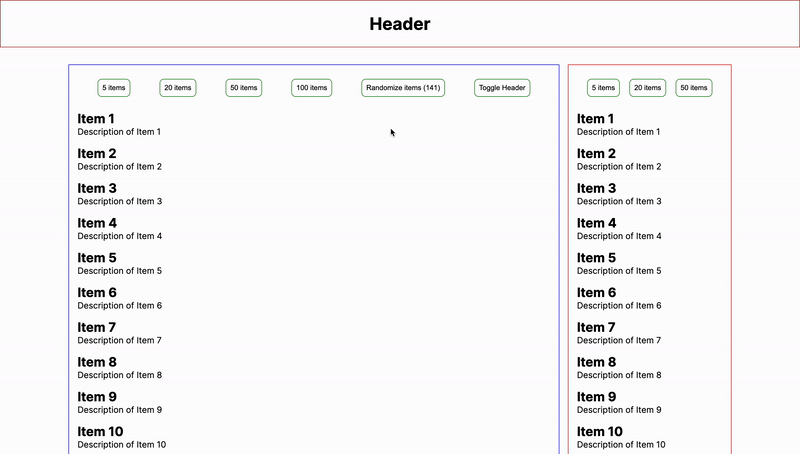
Playground
Check out the GitHub repo where you can see the full implementation and also access an example to play with the sidebar by dynamically setting the elements on the main content or the sidebar itself. I have intentionally skipped sharing the verbose bits of the useStickyElement hook in this article to focus on more conditional logic which makes it work.
Conclusion
The implementation doesn't try to be generic but is specific to the use case of getting that Sticky scrollable element behavior as we see in the sidebars.
For the readers of this article, I have some open-ended questions for you:-
How would you have implemented it differently? Do you have a less JS and more CSS-based implementation in mind?
What optimizations can be done to the current implementation?
What libraries are doing this great? For eg; I played with
react-stickynodeandreact-sticky-boxbefore writing this implementation. They both worked fine but I noticed with dynamic loading content (infinite scrolling) or zooming in and out, there was some jumpy behavior. Although they are made with much more configurability in mind.